
Visualization Infographic
Tools
Adobe Illustrator
Duration
3 weeks
Visual Design
Data Visualization
Typography
Overview
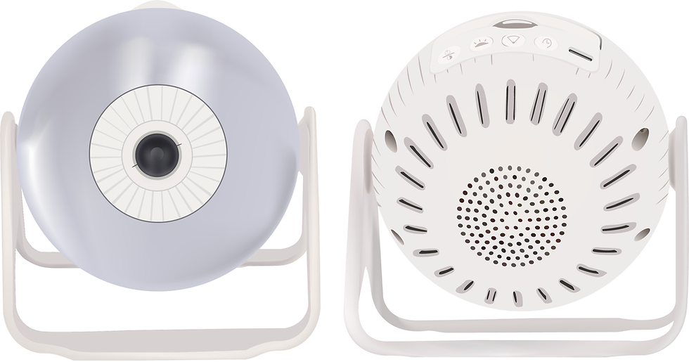
An instructional visualization designed to guide users through operating a nightlight projector using clear, visual-first communication. The infographic replaces dense written manuals with a single-page, step-by-step layout that breaks down components, interactions, and sequencing in an intuitive way.
By combining labeled diagrams, directional cues, and a calm nighttime colour palette, the design prioritizes clarity and ease of use, especially in low-light environments. The project focuses on reducing friction, supporting quick understanding, and demonstrating how thoughtful visual hierarchy can make physical products easier and more approachable to use.
.png)
Target Audience
The Spectaxy Nightlight and Projector is targeted for young children aged 3-10 to help create a sense of comfort at bedtime.
Parents aged 25-50 are responsible for operating the projector and using the infographic.
Sketches
Early sketches explored the product’s form, components, and instruction flow, helping shape both the visual structure and step-by-step guidance before moving into digital refinement.


Layout Study
Different layout variations were tested to establish strong visual hierarchy, guide the eye through each step, and balance diagrams with instructional content for an intuitive, easy-to-follow experience.


Colour Study
I explored background colours and gradients to support readability, contrast, and a calm nighttime mood. Multiple variations were tested to ensure the product remained visually clear while allowing instructional elements and accent colours to stand out without overwhelming the viewer.


Type Study
This study explores typography options to balance playfulness and readability. Omnium was selected for its futuristic feel and strong fit with the infographic. As a sans-serif, it performs better on a dark interface compared to a serif option like Davies, improving clarity and legibility.

Final Design
Spectaxy Nightlight and Projector Infographic.
Takeaways
1
Iteration strengthens outcomes
Exploring multiple layouts, colour palettes, and type options helped refine the final design into a more intuitive and approachable solution.
2
Hierarchy and contrast drive clarity
Thoughtful use of scale, colour, and typography is essential for readability, especially in low-light or nighttime contexts.
3
Visual-first instruction reduces friction
Breaking down complex interactions into labeled diagrams and step-by-step visuals makes physical products easier to understand than text-heavy manuals.