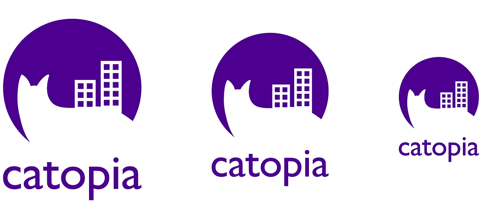
"Catopia" Logo and Branding
Brand Identity
YEAR
2023
Designer
ROLE
Project Overview
Catopia is an urban cat daycare that provides a safe, playful, and caring environment for cats while their owners are away. The goal of this branding project was to create a logo that communicates comfort, trust, and fun, while visually reflecting Catopia’s city-based services.
The final logo combines the silhouette of a cat with a simplified cityscape, symbolizing protection and companionship within a busy urban setting. By pairing soft, rounded shapes with clean geometry and the friendly Gill Sans typeface, the brand feels both reliable and approachable, perfectly suited to a company dedicated to feline happiness and wellbeing.
Tools Used

The Challenge
To design a logo for a city-based cat daycare that feels both playful and trustworthy. The brand needed to communicate safety, comfort, and high-quality care, while also standing out in an urban environment and appealing to cat owners looking for a reliable place to leave their pets.
The Solution
I created a logo that combines a cat silhouette with a simplified cityscape, symbolizing protection and companionship within the urban setting. Rounded shapes and smooth lines reflect the gentle and playful nature of cats, while the structured buildings communicate reliability and stability. The use of Gill Sans adds a friendly, modern tone and ensures strong readability across all branding applications. Together, these choices create a visual identity that is welcoming, trustworthy, and perfectly aligned with Catopia’s mission of providing high-quality care for every cat.
Ideas
I explored a wide range of logo ideas to find the best balance between cat personality and urban identity for Catopia. Early concepts focused on integrating a cat silhouette with buildings in different ways — wrapping around the city, emerging from behind structures, or incorporating windows directly into the cat’s body.
I also experimented with various compositions, including house shapes, circles, and wordmark-focused designs where the cat interacted with the letterforms. These explorations helped me evaluate how playful or structured each direction felt, and how clearly the logo communicated that Catopia is a city-based cat daycare.
Through iteration, I found that simplified shapes and a clean circular layout created the strongest visual message: Cats being cared for within a safe and cozy city environment. This led to the final mark where a curled cat silhouette embraces the urban skyline.


Type Study
I tested a range of typefaces to find one that matched Catopia’s friendly and trustworthy personality. Some options felt too playful or too formal, but Gill Sans offered the right balance with smooth curves that complement the cat icon while remaining clear and readable. This ensured the wordmark supported both the caring and reliable nature of the brand.

Colour Study
I explored a wide range of colours to determine which best represented Catopia’s brand personality. Bright, saturated colours created a fun and energetic tone, while cooler tones offered a calmer and more comforting feel.
Through testing, I found that purple captured the strongest balance. It feels friendly, trustworthy, and a little bit luxurious, which aligns with Catopia’s mission of pampering every cat with high-quality care. Purple also stands out well in an urban environment and maintains strong visibility across digital and print applications.
Refining different purple shades and gradients helped ensure the final palette remained bold, modern, and distinctive.

Final Logo
Large, medium, and small variations.


Envelope Design


Letterhead Design


