Spectaxy Nightlight Infographic
Product Visualization
YEAR
2025
Designer
ROLE

Project Overview
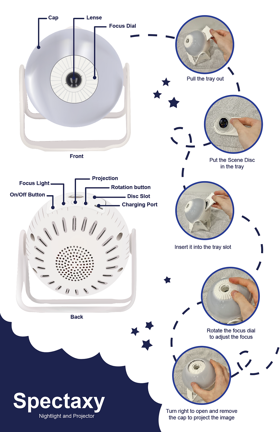
This infographic explains how to use the Spectaxy Nightlight and Projector, a calming bedtime device designed for children. The goal of the project was to clearly communicate the product’s features and step-by-step setup in a way that feels approachable, intuitive, and visually engaging.
The layout pairs labeled product diagrams with real-world photographs, allowing users to easily connect instructions to the physical device. Bright and playful elements like stars, curved pathways, and a deep night-sky background reinforce the nighttime theme while guiding the viewer through each step. Clear typography and numbered visuals ensure the information is easy to follow for both children and caregivers.
This infographic helps users quickly understand how to operate the nightlight, making the experience smooth and enjoyable right from the first use.
Tools Used

The Challenge
To communicate the setup and functionality of the Spectaxy Nightlight and Projector in a way that is clear, friendly, and easy for users of all ages, especially caregivers who may be interacting with the product for the first time. The infographic needed to simplify multiple steps without overwhelming the viewer.
The Solution
I combined labeled diagrams with real product photos to make each step easy to recognize and follow. A numbered path with playful icons visually guides users through the process, while the night-sky theme reinforces the purpose of the product. Bright orange highlights draw attention to key instructions, helping users confidently set up and enjoy the nightlight right away.
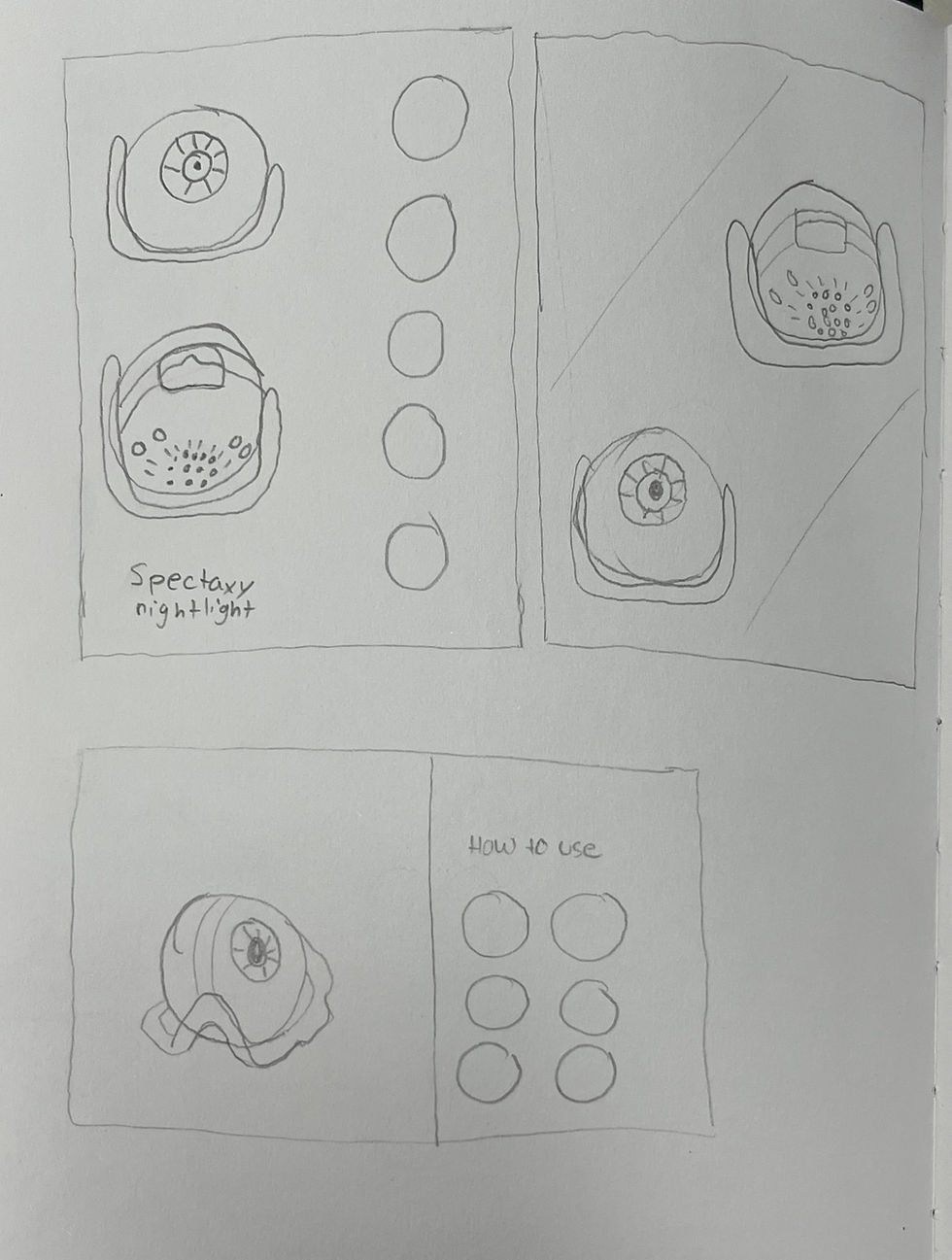
Sketches
I explored different viewing angles to understand how best to communicate the product’s features. While the angled view showed more depth, I ultimately chose to use the front and back orientations in the final infographic because they clearly display the controls, buttons, and lens placement for easier user understanding.

Layout Sketches
Quick skeches to explore layout ideas.


Drawing in Illustrator
To achieve a more realistic and high-quality look, I used the Mesh Tool in Adobe Illustrator to create smooth shading and subtle highlights on the product surfaces. This technique allowed me to blend tones and follow the curved shape of the device, making the lens and body appear rounded and reflective, similar to the real object.
By adjusting anchor points and colour transitions, I was able to add depth without harsh gradients, helping the renderings look more polished and professional while still maintaining a clean vector style.

Type Study
I chose Omnium because its slightly futuristic style fits the theme of the Spectaxy Nightlight and Projector, while still remaining easy to read. Since it is a sans-serif font, it also maintains strong clarity on a dark background, making it more suitable for the nighttime-inspired interface.

Line Study
To ensure all labels in the infographic were clear and readable, I tested a range of line weights and colours against the dark blue background as well as the light surface of the device. Blue blended too much into the background, yellow appeared too bright and distracting, and some other hues lost contrast on the product itself.
After comparing multiple options, I selected orange because it provides strong contrast on both the background and the device, while also feeling warm, energetic, and easy for the viewer to follow. This makes the instructional path visually clear without overpowering the rest of the design.

Iterations
Throughout the development of the infographic, I tested multiple visual directions to improve clarity, readability, and engagement. I experimented with different line colours, label styles, and typefaces to ensure the viewer could easily follow the steps without feeling overwhelmed. I also adjusted the hierarchy and spacing of elements to create a smoother visual flow from top to bottom.
Each iteration helped refine how instructions were communicated, improving contrast, guiding the eye more effectively, and enhancing the nighttime theme of the product. This process allowed me to arrive at a final design that is both visually appealing and highly functional for users.


Final Design