
Effervescent Sign-In Page
Tools
Adobe Illustrator
Adobe XD
Duration
1 week
Overview
A static page shaped around the adjective "effervescent," translating its meaning of light, lively, and full of energy into a visual interface. Floating forms, soft colour gradients, and bubbly textures create a sense of motion and optimism, making the sign-in experience feel playful and inviting rather than routine. Every design choice, from the rounded shapes to the cheerful micro-copy, reinforces this effervescent quality, exploring how a single descriptive word can guide tone, mood, and interaction in interface design.
Interface Design
Exploratory
Concept Development
Early Sketches
These sketches explore playful layouts, organic shapes, and bubbly typography. They focus on capturing a light, energetic feel while testing clear hierarchy and intuitive form placement before refining the design.

Timed Sketches
These timed sketches show how the idea developed with more time. The quick sketch focuses on structure, while the longer ones explore playful, bubbly shapes that better express the effervescent theme.

Six Thinking Hats
I applied the Six Thinking Hats by asking my peers to respond to each perspective, which helped me evaluate the sketch more critically. Their feedback highlighted the emotional tone, potential risks, and creative opportunities, guiding refinements to better emphasize the effervescent, energetic direction.

Blue Hat
Does the direction intensify it?
White Hat
It kind of looks like a fireball.
Red Hat
Very energetic and happy!
Black Hat
I've never seen a circular sign-in page before.
Green Hat
What if you addd more circles on the outside?
Yellow Hat
The representation of the face makes it very energetic and happy.
Wireframe
This wireframe uses bubbles and circular shapes to express the effervescent theme while mapping out a clear flow. It focuses on layout and hierarchy, keeping things playful without losing usability.


Iterations
These iterations explore how colour, contrast, and background density affect the effervescent feel of the page. Each version explores the balance between playfulness and clarity, testing brighter palettes, softer gradients, and bubble density to keep the interface energetic without overwhelming the form elements.


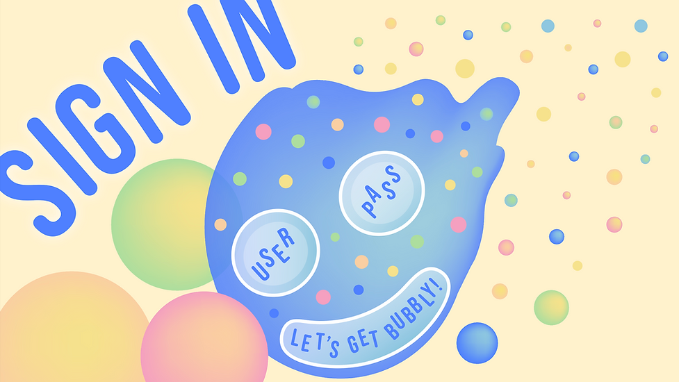

Final Design
Effervescent Sign-In Page

Takeaways
1
Starting loose leads to stronger ideas
Quick, imperfect sketches made it easier to explore playful directions without overthinking, which helped the concept stay expressive rather than safe.
2
Concept needs structure to work
Translating an abstract word like "effervescent" into an interface showed that expressive visuals still need clear form and constraints to remain usable.
3
Feedback sharpens intention
Hearing how others interpreted the design helped clarify what was reading as “playful” versus what was becoming confusing, guiding more intentional design decisions.